Dreams come true...


Привет всем! Сегодня я не пишу на свадебную тематику а решила сделать открыточку для участия в челендже Less is more . Не могу сказать, что я частенько принимаю участия в подобных штуках (вернее почти никогда) ...но так как черный + белый мое любимое сочетание почему бы и нет?! Задача стояла создать открыточку в черно - белых тонах с добавлением третьего яркого пятна. Выбор без запинки па на красный цвет ибо это еще один из моих любимых цветов :-)
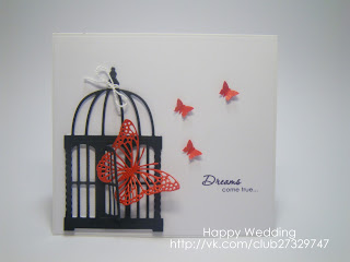
Hi Every one! I am not writing on a Wedding Theam today ( finally), but I decided to take part in a chalenge Less is more. Can't say that I take part in chalages often (almost never )... but as black + white are my favourite olourse why not?! The aim was to create a card in black and white colourse with a splash on another bright colour. There was no doubt what to chose as red is among my favaourite colourse also. :-)
So take a look, hope u'll like it ;-)
love the touch of red
ОтветитьУдалитьSheel
x
Thans a Lot! :-)
УдалитьThis is gorgeous, I love it... beautifully simple and very striking!
ОтветитьУдалитьThanks so much... do join us again.
Chrissie
"Less is More"
We would be really grateful if you could remove the word verification from your blog!
Thanks
Thanks, for your sweet words.They are really pleasurable :-)
УдалитьHope to join you again